main topic interpreting results session commands see also
You are a quality engineer for a tire company and you need to quantify the various causes for tire repairs in the past year. You categorize and count all the reported instances of tire failure for the year. You suspect that the causes vary by quarter. For each cause, chart the number of tire repairs stacked by quarter, in decreasing order.
1 Open the worksheet TIRES.MTW.
2 Choose Graph > Bar Chart.
3 From Bars represent, choose Values from a table.
4 Under Two-way table, choose Stack. Click OK.
5 In Graph variables, enter 'Damaged Liner' 'Damaged Sidewall' 'Leak from Seating' 'Puncture' 'Valve Core Leak' 'Valve Stem Leak'.
6 In Row labels, enter Quarter.
7 Make sure that Stack innermost category values is checked.
8 Click Bar Chart Options.
9 Under Order Main X Groups By, choose Decreasing Y. Click OK in each dialog box.
Graph window output
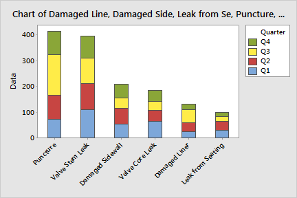
The most frequent cause of air loss is Puncture, followed by Valve Stem Leak, Damaged Sidewall, Valve Core Leak, Damaged Liner, and Leak From Seating.
|
Tip |
To see the y-axis value and the subtotal for a particular bar segment and those below it, hover your cursor over the segment. |
A disproportionate amount of punctures occurred in the third quarter. You may want to further investigate this phenomenon.