main topics interpreting results session command see also
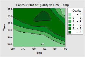
Your company manufactures frozen foods and you need to determine the optimal time and temperature for reheating a new frozen entree. You reheat samples at various times and temperatures, then have trained judges rate each for overall quality on a scale of 0 (not enjoyable) - 10 (most enjoyable). Create a contour plot to examine the results. Add contour lines to enhance the plot.
|
Create a contour plot 1 Open the worksheet REHEAT.MTW. 2 Choose Graph > Contour Plot. 3 In Z variables, enter Quality. In Y variable, enter Time. In X variable, enter Temp. 4 Click Data View. 5 Under Data Display, check Contour lines. 6 Click OK in each dialog box. |
|
Adding the contour lines helps define the shaded regions more sharply. In this graph, darker regions indicate higher z-values. These higher z-values seem to form a ridge running from the upper left of the graph to the middle right. The valleys in the lower part of the graph and the upper right represent time-temperature combinations that result in under-cooked or over-cooked entrees (respectively).
Because you are interested in locating the highest quality values (which range from 0-10), you decide to customize the contour levels.
|
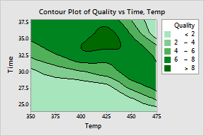
Customize the contour levels 1 Choose Editor > Graph Options. 2 Click the Levels tab. 3 Under Contour Levels, choose Values and enter 2 4 6 8. 3 Click OK. |
|
The modified contour levels reveal a peak centered at about Time 35 and Temp 425. Quality scores in this peak region are greater than 8.
Additional examples that help visualize these data include: