overviews how to example data see also
Graph > Pie Chart
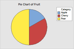
Use to display the proportion of each data category relative to the whole data set.
After creating a pie chart, you can explode specific slices from the pie center in order to highlight them. See Edit Pie > Explode.
Chart counts of unique values: Choose when each row in a column represents a single observation. Each slice in the pie is proportional to the number of occurrences of a value in the column.
Categorical variables: Enter one or more columns of categorical data to chart. Minitab displays a separate pie chart for each column, on the same graph. (To display each pie chart on a separate graph, use Multiple Variables.)
Chart values from a table: Choose when the category names are in one column and summary data are in another column.
Categorical variable: Enter the column of categories.
Summary variables: Enter one or more columns of summary data for each category. Minitab displays a separate pie chart for each column, on the same graph. (To display each pie charts on a separate graph, use Multiple Variables.)