
Analyze Mixture Design
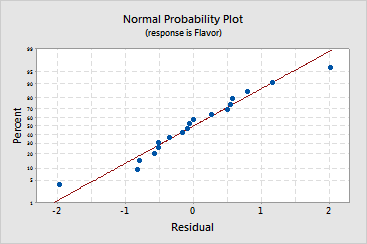
Graphs - Normal Probability Plot of the Residuals
![]()
![]()
![]()
|
|
Analyze Mixture DesignGraphs - Normal Probability Plot of the Residuals |
|
This graph plots the residuals versus their expected values when the distribution is normal. The residuals from the analysis should be normally distributed. In practice, for balanced or nearly balanced designs or for data with a large number of observations, moderate departures from normality do not seriously affect the results.
The normal probability plot of the residuals should roughly follow a straight line. Use this plot to look for the following:
|
This pattern... |
Indicates... |
|
Not a straight line |
|
|
Curve in the tails |
|
|
A point far away from the line |
An outlier |
|
Changing slope |
If your data have fewer than 50 observations, the plot may display curvature in the tails even if the residuals are normally distributed. As the number of observations decreases, the probability plot may show even greater variation and nonlinearity. Use the normal probability plot and goodness-of-fit tests to assess the normality of residuals in small data sets.
Example Output |
|
Interpretation |
|
For the fondue data, the points fall fairly close to a straight line indicating that the data are fairly normal. Although the point in the lower tail appears to be an outlier, you can draw a straight line through the data and this point will be fairly close. In addition, it does not fail the statistical test for normality.