
Analyze Taguchi Design
Graphs - Main Effects Plot
![]()
![]()
![]()
|
|
Analyze Taguchi DesignGraphs - Main Effects Plot |
|
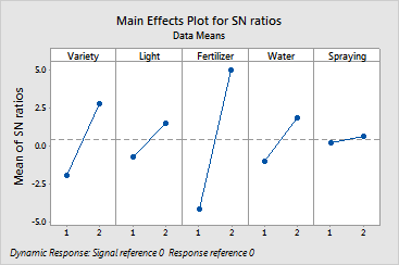
Main effects plots show how each factor affects the response characteristic. A main effect is present when different levels of a factor affect the characteristic differently. For a factor with two levels, you may find that one level increases the mean compared to the other level. This difference is a main effect.
Minitab creates the main effects plot by plotting the characteristic average for each factor level. These averages are the same as those displayed in the response table. A line connects the points for each factor. Look at the line to determine whether or not a main effect is present for a factor.
By comparing the slopes of the lines, you can compare the relative magnitude of the factor effects.
Example Output |
|
Interpretation |
|
For the basil data, the main effects plot for the signal-to-noise ratio is shown. The plots indicate the following: