
Bubble Plot
![]()
![]()
![]()
|
|
Bubble Plot |
|
The symbols (also called bubbles) on a bubble plot represent the following three values for each observation:
In addition, you can use data labels to show the value of a fourth variable, which can be either continuous or categorical. And you can use symbols of different colors to represent the values of up to three categorical grouping variables.
|
Note |
Because bubble size can represent only positive values, bubble plots do not show observations for which the bubble size values are less than or equal to 0. You can customize the size and other attributes of bubbles after you create the graph. Select the bubbles and choose Editor > Edit Bubbles. |
Use a bubble plot to look for relationships among the variables, such as the following:
Example Output |
|
Interpretation |
|
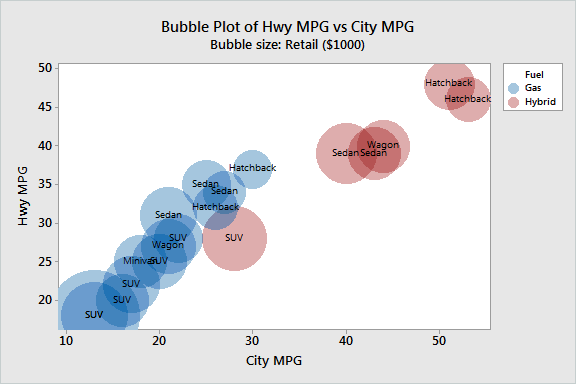
The bubble plot shows that Highway (Hwy) and City mileage are highly correlated. Cars with better city mileage also tend to have better highway mileage.
The red bubbles represent hybrid vehicles, which use a combination of electric power and gas. The blue bubbles represent vehicles that are powered only by gas. Not surprisingly, all 5 of the cars that have the best mileage are hybrid vehicles. Hybrid cars appear to be especially beneficial for city driving. The best hybrid gets approximately 25 more miles per gallon than does the best gas vehicle. For highway driving, the difference is less. The best hybrid gets approximately 10 more miles per gallon than does the best gas vehicle.
Most of the larger bubbles belong to SUVs (sport utility vehicles), which indicates that SUVs are the most expensive vehicles. SUVs also tend to get the fewest miles per gallon, because they weigh more than most other vehicles. The hybrid that has the worst mileage is an SUV.