
Individual Value Plot
![]()
![]()
![]()
|
|
Individual Value Plot |
|
Individual value plots contain several key elements:
|
Note |
If several points in the same group have the same value, Minitab offsets them symmetrically from the center so that each identical point is visible. |
Individual value plots can help you visualize the shape and spread of sample data, uncover any outliers, and compare distributions:
You might create an individual value plot before or during an analysis to help confirm assumptions and guide further analysis.
Example Output |
|
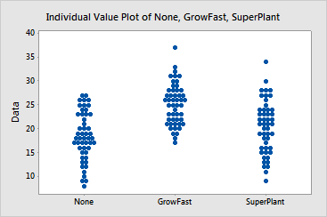
Interpretation |
|
For the plant growth data, the individual value plot shows that GrowFast has produced the tallest plants overall (mode is 25 centimeters) and the variability in height seems to be roughly equivalent to the group with no fertilizer (mode is 16 centimeters). SuperPlant also increased the plant height compared to plants receiving no fertilizer; however, its variability is greater and SuperPlant did not have a positive effect on a large proportion of the seedlings. Its distribution is also relatively flat and multi-modal. The graph suggests that GrowFast had a greater increase on plant growth, and it did so more consistently. You can test this effect using a procedure such as ANOVA.