Interval plots contain several key elements:
· The
mean on the y-axis.
· Groups
based on categorical grouping variables
along the x-axis.
· The
mean
value represented by a circle.
· The
interval represented by a vertical line with horizontal lines at the upper
and lower limits. By default, Minitab displays individual 95% confidence intervals
around the mean.
Use interval plots to display the sample mean along with a range of
likely values for the population mean.
Example Output |

|
Interpretation |

|
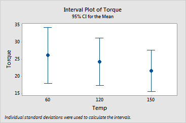
This interval plot shows the amount of torque applied at different temperatures
before the chucks spun out of the log. Although the means appear to be
different, the difference is probably not significant because all the
interval bars easily overlap:
· The
mean torque applied at 60 degrees is 26.1, and the 95% confidence interval
extends from 17.9 to 34.4.
· The
mean torque applied at 120 degrees is 24.3, and the 95% confidence interval
extends from 17.4 to 31.1.
· The
mean torque applied at 150 degrees is 21.6, and the 95% confidence interval
extends from 15.5 to 27.7.
