
Scatterplot
![]()
![]()
![]()
|
|
Scatterplot |
|
Scatterplots typically contain the following elements:
Use a scatterplot to assess the direction, strength, and linearity of the relationship between two variables:
You can visually determine if the relationship is linear or curved. If the relationship is curved, then you may need to include higher-order terms to accurately model the curvature (see polynomial regression).
Use scatterplots instead of time series plots when your time-dependent data are not chronologically ordered, or if the data collection intervals are irregular.
Example Output |
|
Interpretation |
|
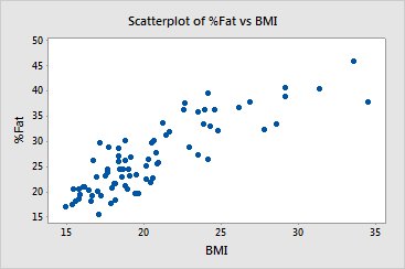
The scatterplot for the BMI and fat data shows a strong positive and linear relationship between the two variables. Body Mass Index (BMI) may be a good predictor of body fat percentage.