
P Chart
Graphs - P Chart
![]()
![]()
![]()
|
|
P ChartGraphs - P Chart |
|
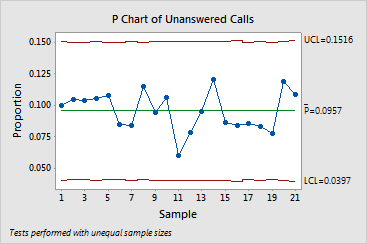
The P chart consists of the following:
- When your sample sizes are the same or when you choose to use an average sample size, then the control limits will be fixed.
- When your sample sizes vary, then the control limits will vary. You should examine the P chart for points outside the control limits and trends or other nonrandom patterns.
Minitab conducts up to four tests for special causes for the P chart, which detect points beyond the control limits and specific patterns in the data. Points that fail are marked with a red asterisk and the number of the failed test. Complete results are available in the Session window. A failed point indicates that there is an unusual value or a nonrandom pattern, either of which may be the result of special-cause variation. These points should be investigated.
Example Output |
|
Interpretation |
|
The P chart for the telephone data can be summarized as follows: