
P Chart Diagnostic
Graphs - P Chart Diagnostic
![]()
![]()
![]()
|
|
P Chart DiagnosticGraphs - P Chart Diagnostic |
|
The results of the P Chart Diagnostic include the following elements:
- If the ratio is greater than the 95% upper limit, your data exhibit significant overdispersion.
- If the ratio is less than 60%, your data exhibit significant underdispersion.
If your data exhibit overdispersion or underdispersion, a Laney P' chart may more accurately distinguish between common cause variation and special cause variation than a traditional P chart.
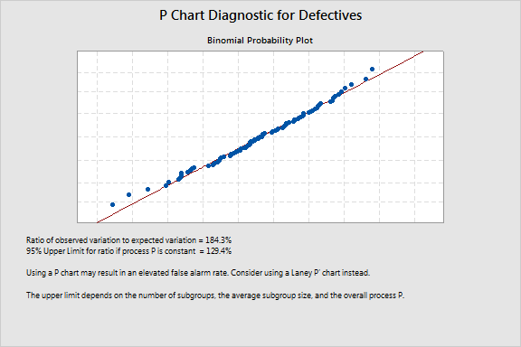
Example Output |
|
Interpretation |
|
The high ratio of observed variation to expected variation, 184.3%, suggests overdispersion. The ratio is greater than the 95% upper limit, 129.4%. Overdispersion can cause points on a traditional P chart to appear to be out of control when they are not. To correct for overdispersion, use a Laney P' chart.
To see the same data plotted on both a traditional P chart and a Laney P' chart, see Comparing traditional P charts and Laney P' Charts.