
Gage R&R Study (Expanded)
Graphs - Xbar Chart
![]()
![]()
![]()
|
|
Gage R&R Study (Expanded)Graphs - Xbar Chart |
|
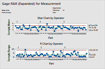
The ![]() chart consists of the following:
chart consists of the following:
Because the parts chosen for a Gage R&R study should represent the entire range of possible parts, this graph should ideally show lack-of-control. Lack-of-control exists when many points are above the upper control limit and/or below the lower control limit.
Example Output |
|
Interpretation |
|
For the refraction data, few points are beyond the control limits for each operator. This indicates that the measuring system is inadequate.