
Gage Run Chart
Graphs - Run Chart


|
|
Gage Run ChartGraphs - Run Chart |
|
The run chart consists of the following:
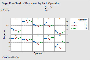
The plot allows you to see if any patterns are evident in the data. For instance, you might see that one operator consistently measures higher than the others or that the measurements on certain parts vary more when compared to other parts.
Example Output |
|
Interpretation |
|
Most of the variation here is due to differences between parts. This scenario is what you would like to have happen since the goal is to see if the measuring system can distinguish between parts.
Free online chart generators for statistical analysis:
Useful tools:

