
Multivariate EWMA Chart
Graphs - Multivariate EWMA Chart
![]()
![]()
![]()
|
|
Multivariate EWMA ChartGraphs - Multivariate EWMA Chart |
|
A multivariate EWMA chart consists of:
Minitab marks points outside of the control limits with a red symbol, which indicates the presence of special causes. When you append the graph to the ReportPad, the complete test results are available. A failed point indicates that a nonrandom pattern exists in the data that may be the result of special-cause variation. You should investigate these points.
Example Output |
|
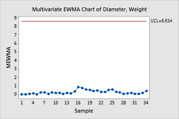
Interpretation |
|
You can summarize the multivariate EWMA chart for the dinnerware data as follows: