Use the Z chart to assess whether the process center
is in control.
The Z chart consists of:
· Plotted
points, which are standardized
values.
· Center line
(green), which the estimate of the process average
across runs. The center line is always located at zero because the data
is standardized. Standardized data come from a population with m = 0 and s = 1.
· Control limits
(red), which are located 3 s
(standard deviations)
above and below the center line and provide a visual means for assessing
when the process is out of control.
The lower and upper control limits are always -3
and +3, respectively, because the data is standardized. Standardized data
comes from a population with s = 1 and m = 0.
· Dashed
vertical lines, which separate one run from the next.
You should examine the Z chart to see if it is in control.
· Determine
whether or not any points are located above or below the upper and lower
control limits.
· For
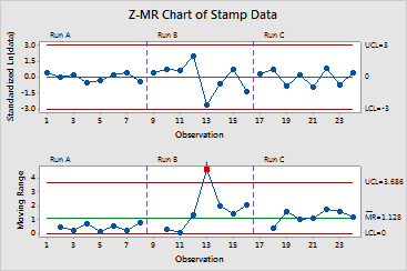
the stamp data, no points are located beyond the control limits.
· Compare
the pattern of data points across runs. Do the points fall within the
control limits in a random
manner? Does one run have larger standardized values than other runs?
Example Output |

|
Interpretation |

|
For the stamp data, the standardized values for Run B seem to vary more
than those for Run A or Run C. Thus, there may be special
causes
influencing the process. At this point, you would want to try to identify
and correct the factors contributing to the special-cause variation. Until
these causes are eliminated, the process cannot achieve a state of statistical
control.