
Plots and p-values
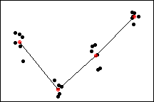
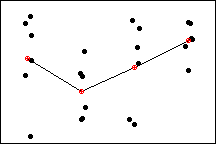
The data sets in the two individual value plots below have exactly the same factor level means. Therefore, the variability in the data due to the factor is the same for both data sets. Looking at the plots, you might be tempted to conclude that the means are different in both cases. Notice, however that the variability within factor levels is much greater in the second data set than in the first.
To evaluate the differences between means, you must compare these differences with the spread of the observations about the means. This is exactly what an analysis of variance does. Using analysis of variance, the p-value corresponding to the first plot is 0.000, whereas the p-value corresponding to the second plot is 0.128.
Therefore, using an a-level of 0.05, the test says the means in the first data set are significantly different. The differences in the sample means for the second data set, however, could very well be a random result of the large overall variability in the data.
Plot with low variability
Plot with high variability
Free online chart generators for statistical analysis:
Useful tools: