
Main Effects Plot
Graph of Means - Factors Showing Similar Effects


|
|
Main Effects PlotGraph of Means - Factors Showing Similar Effects |
|
The main effects plot is most useful when you have several factors. You can then compare the changes in the level means to see which factors influence the response the most. A main effect is present when different levels of a factor affect the response differently. For a factor with two levels, you may find that one level increases the mean compared to the other level. This difference is a main effect.
Minitab creates the main effects plot by plotting the response mean for each factor level. A line connects the points for each factor. Minitab also draws a reference line at the overall mean. Look at the line to determine whether or not a main effect is present for a factor.
By comparing the slopes of the lines, you can compare the relative magnitude of the factor effects.
Although a table of means and a plot of means provide the same numerical information, you may find it easier to judge a plot than a table of numbers. As always, plots indicate patterns. To determine if a pattern is statistically significant, you must do an appropriate test.
Example Output |
|
Interpretation |
|
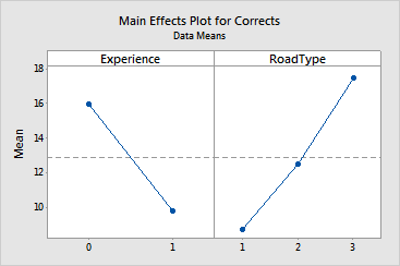
For the driving data, the plots indicate the following:
These plots do not show any dramatic difference in the magnitude of the effect on the response between the factors Experience and RoadType. Both factors seem to affect the response by approximately the same amount. The response changes with Experience from approximately 16 to 10, with Road Type from about 9 to 12.5 to 17.5.
Free online chart generators for statistical analysis:
Useful tools:

