
Display Descriptive Statistics
Graphs - Histogram of Data with Normal Curve
![]()
![]()
![]()
|
|
Display Descriptive StatisticsGraphs - Histogram of Data with Normal Curve |
|
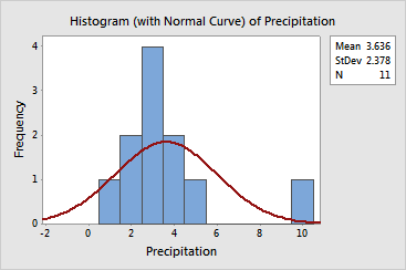
You can use a histogram of the data overlaid with a normal curve to assess the normality of your data. A normal distribution is symmetric and bell-shaped, as indicated by the curve. (Note that the curve is truncated where it extends beyond the borders of the graph.) It is often difficult to evaluate normality with small samples.
Example Output |
|
Interpretation |
|
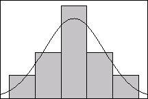
The precipitation data do not follow the normal curve. This is largely due to the outlier at the far right of the graph. Without this outlier, the data look much more normal, as illustrated below.
| Minitab help | Stat | Graph | SixSigma | DOE | Glossary | Reliability | SPC,MSA,CPK | ||
|
|||||||||