
Principal Components
Graphs - Score Plot
![]()
![]()
![]()
|
|
Principal ComponentsGraphs - Score Plot |
|
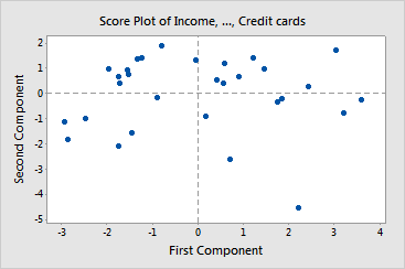
The score plot graphs the second principal component scores versus the first principal component scores. If the first two components account for most of the variance in the data, you can use the score plot to assess the data structure and detect clusters, outliers, and trends. The plot may reveal groupings of points, which may indicate two or more separate distributions in the data. If the data follow a normal distribution and no outliers are present, the points are randomly distributed around zero.
To create plots for other components, store the scores and use Graph > Scatterplot.
Example Output |
|
Interpretation |
|
For the loan applicant data, the point in the lower right hand corner may be an outlier. Investigate this point further.
| Minitab help | Stat | Graph | SixSigma | DOE | Glossary | Reliability | SPC,MSA,CPK | ||
|
|||||||||