
Factorial Plots
Poisson Regression
Main Effects Plot - Graph of Means


|
|
Factorial Plots
|
|
The main effects plot is most useful when you have several categorical variables. You can then compare the changes in the level means to see which categorical variable influences the response the most. A main effect is present when the mean of the response changes at the different levels of the variable. For a variable with two levels, the mean is higher at one level of the variable than at another level. This difference is a main effect. Main effects are only interpretable if the interaction effects are not significant.
Minitab creates the main effects plot by plotting the fitted means for each variable in the model. Minitab can plot data means for variables that are not in the model. A line connects the points for each variable. Look at the line to determine whether or not a main effect is present for a variable.
By comparing the slopes of the lines, you can compare the relative magnitude of the effects.
Factorial plots do not use the data in the worksheet for the fitted means. Instead, Minitab estimates the fitted means based on a stored model. You must fit a model before you can generate a factorial plot. To produce an interaction plot, you must include two or more variables in the plots. Factorial plots are accurate only if the model represents the true relationships.
Example Output |
|
Interpretation |
|
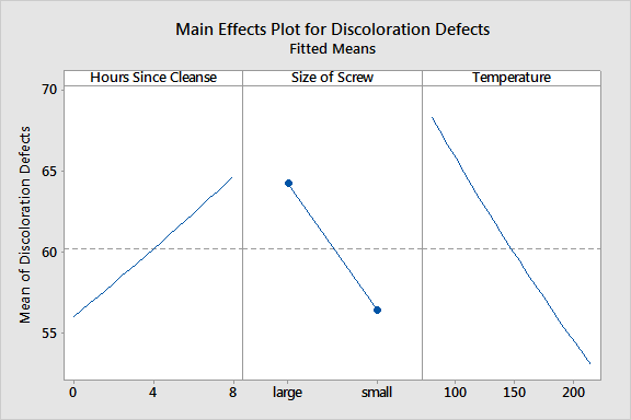
For the resin defect data, the plots indicate the following:
The magnitude of the main effect for Temperature appears to be larger than the other variables. The main effects are only interpretable if the interaction effects are not significant.
Free online chart generators for statistical analysis:
Useful tools:

