
Decomposition
Graphs - Seasonal Analysis


|
|
DecompositionGraphs - Seasonal Analysis |
|
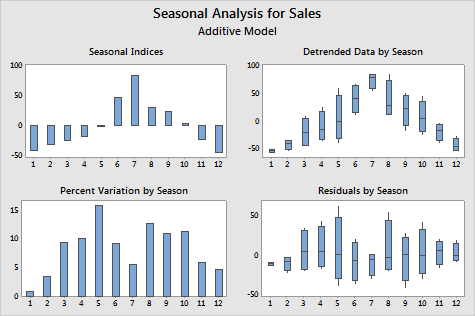
The decomposition procedure analyzes the seasonal indices and variation within each season of the time series. The separate graphs represent:
Example Output |
|
Interpretation |
|
For the sales data, the chart of the seasonal indices indicates that the sport equipment sales experience average downward movements in the first 5 months and the last 2 months of the season and average upward movements in the 6th to the 10th month. The chart of percent variation by season shows that the 1st month has the least variation and the 5th month has the most variation. The boxplots of the detrended data by season show that months where the absolute value of the seasonal effect is large--the 1st, 2nd, 7th, 11th, and 12th-- tend to have less variation than months where the seasonal effect is smaller--the 3rd, 4th, 5th, 6th, 8th, 9th, and 10th. There is no obvious effect of season on the residuals in the boxplots of the residuals by season.
Free online chart generators for statistical analysis:
Useful tools:

