
Moving Average
Graphs - Smoothed versus Actual


|
|
Moving AverageGraphs - Smoothed versus Actual |
|
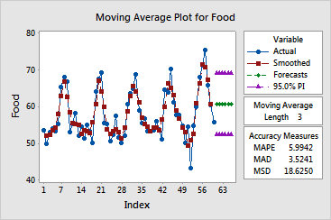
The moving average procedure draws a graph containing the observations, smoothed values, and forecasts, versus time. The smoothed values are the moving averages obtained by averaging consecutive data in the series. The forecasts are the moving average at the forecast origin. The graph allows you to visually inspect how moving averages fit your data.
The moving average procedure also displays, along with the graph, three measures to help you determine the accuracy of the fitted values: MAPE, MAD, and MSD. The three measures are not very informative by themselves, but they are used to compare the fits obtained by using different methods. For all three measures, smaller values generally indicate a better fitting model.
Example Output |
|
Interpretation |
|
For the employment data, the graph shows that the data are fit fairly well by the moving average procedure.
Free online chart generators for statistical analysis:
Useful tools:

