main topic interpreting results session command see also
In this example, you add a stamp column to identify the subgroups by date rather than by number.
1 Open the worksheet CRANKSHD.MTW.
2 Choose Stat > Control Charts > Variables Charts for Subgroups > R.
3 Choose All observations for a chart are in one column, then enter AtoBDist.
4 In Subgroup sizes, enter 5.
5 Click Scale. Under X Scale, choose Stamp. Enter Date.
6 Click OK in each dialog box.
Angle the x-axis labels to make them easier to read.
7 Double-click one of the dates on the x-axis.
8 Click the Alignment tab. In Text angle, type 45.
9 Click OK.
Graph window output
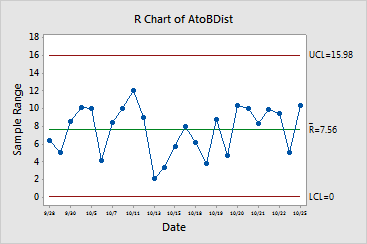
The points are randomly distributed between the control limits, implying a stable process. It is also important to compare points on the R chart with those on the X chart for the same data - see Example of an X chart with tests and customized control limits to see if the points follow each other. These do not - again, implying a stable process.
|
Note |
Stamping with the date can help you determine the date
a particular subgroup of data was collected. In this case, the scale labels
every other subgroup, but on some days more than one subgroup was collected
and on other days no data were not collected (non-working days), so you
may need to investigate a particular date further. |