
Gage Linearity and Bias Study
Graphs - Reference versus Bias Plot
![]()
![]()
![]()
|
|
Gage Linearity and Bias StudyGraphs - Reference versus Bias Plot |
|
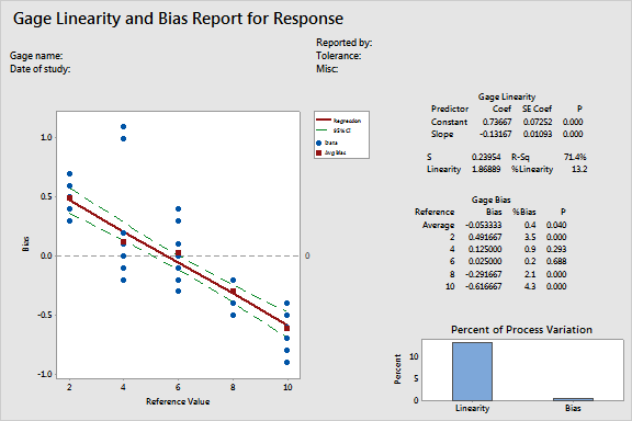
The reference versus bias plot consists of
Ideally you want the deviations for each part to be close to 0 and the line to be horizontal.
Example Output |
|
Interpretation |
|
For the parts data, there appears to be a linearity problem. Measurements for smaller parts are higher than their corresponding reference part measurements, while measurements for larger parts tend to be lower than their corresponding reference part measurements.