Boxplots, also called
box-and-whiskers plots, illustrate the following properties of the data
for each level:
· Shape. The box represents the middle
50% of the data. The line through the box represents the median.
The lines (whiskers) extending from the box represent the upper and lower
25% of the data (excluding outliers).
Outliers are represented by asterisks (*).
· Means. The symbol on each plot represents
the mean of the sample.
|
Note |
Boxplots tend to be most useful when there are many observations
in a data set. |
Example Output |

|
Interpretation |

|
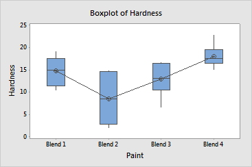
The boxplots of the paint hardness data illustrate the following:
· Blend
4 has the largest hardness values, the largest mean, and the largest median.
· Blend
2 has the smallest values, the smallest mean, and the smallest median.
· The
middle half of the data for Blend 2 is very spread out, as indicated by
the large box.
· Blend
2 also has the largest overall range of values, as indicated by the ends
of the whiskers.
· There
are no outliers (asterisks) in the data for any level.
In this example
there are just six observations per level, so an individual value plot
will probably be more useful than a boxplot.
