
Contour Plot
General Linear Model (GLM)
More Than Two Variables
![]()
![]()
![]()
|
|
Contour Plot
|
|
Use a contour plot to help you visualize the response surface. Contour plots are useful for establishing desirable response values and operating conditions.
A contour plot shows how a response variable relates to two continuous variables based on a model equation. That is, the contour plot represents, in two dimensions, the functional relationship between the response and the variables. Points that have the same response are connected to produce contour lines of constant responses.
Because a contour plot shows only two variables at a time, any extra variables are held at a constant level. Thus, the contour plots are for fixed levels of the extra variables. If you change the hold levels, the response surface changes as well, sometimes drastically.
Contour plot does not use the data in the worksheet. Instead, Minitab estimates the contours based on a stored model. You must fit a model with two or more covariates before you can generate a contour plot. Contour plots are accurate only if the model represents the true relationships.
Example Output |
|
Interpretation |
|
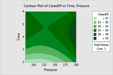
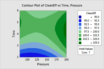
For the cleaning efficiency data, previous analysis showed that pressure and time have quadratic effects on Efficiency, while concentration only has a linear effect. Therefore, it makes sense to hold concentration fixed at its low and high levels and compare the plots. The interpretation of the contour plots is as follows:
The contours correspond to a minimax response surface.