
Test for Equal Variances
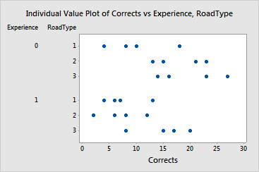
Graphs - Individual Value Plot
![]()
![]()
![]()
|
|
Test for Equal VariancesGraphs - Individual Value Plot |
|
The individual value plot shows all of the observations. Each row of points represents the data from one of the groups formed by the factor levels.
Example Output |
|
Interpretation |
|
For the driving data, the first row of points shows the response (number of driving corrections) for each of the inexperience drivers (Experience = 0) on the first class roads (RoadType = 1). The plot suggests the number of corrections may differ between groups. However, the variability seems similar within each group. This is consistent with the high p-value for the multiple comparisons test.