|
|
Test for Equal VariancesGraphs - Boxplot |
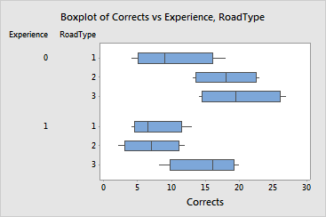
Boxplots, also called box-and-whiskers plots, illustrate several properties of the data for each group. The box represents the middle 50% of the data. The line through the box represents the median. The lines (whiskers) extending from the box represent the upper and lower 25% of the data (excluding outliers). Outliers are represented by asterisks (*).
Outliers can have a strong influence on the results, especially if the sample sizes are small. You should try to determine the cause of any unusual observations and correct any measurement mistakes or data entry errors. Consider removing data that are associated with special causes.
|
Note |
Boxplots tend to be most useful when there are many observations in a data set. |
Example Output |

Interpretation |
For the driving data, the box at the top of the graph summarizes the response data (number of driving corrections) for the inexperience drivers (Experience = 0) on the first class roads (RoadType = 1). The locations and center of the boxes suggest that the number of corrections may differ between groups. However, the width of the boxes and whiskers show that the variability within each group is similar. This is consistent with the high p-value for the multiple comparisons test.