
Paired t
Graphs - Histogram of Differences
![]()
![]()
![]()
|
|
Paired tGraphs - Histogram of Differences |
|
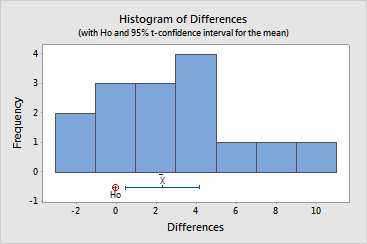
The histogram illustrates the following properties of your data:
![]() represents the mean
difference between paired observations,
which serves as your estimate of m D.
represents the mean
difference between paired observations,
which serves as your estimate of m D.
Example Output |
|
Interpretation |
|
The histogram of the heart rate differences seems to indicate that they are roughly normally distributed. (It is often difficult to evaluate normality when the sample size is small.)
The graph also illustrates that m D is likely to be greater than the reference value specified in H0, since this value (0) is smaller than those within the confidence interval.