
Paired t
Graphs - Individual Value Plot
![]()
![]()
![]()
|
|
Paired tGraphs - Individual Value Plot |
|
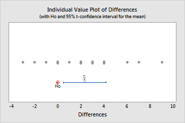
The individual value plot illustrates the following properties of your data:
![]() represents the mean
difference between paired observations,
which serves as your estimate of m D.
represents the mean
difference between paired observations,
which serves as your estimate of m D.
Example Output |
|
Interpretation |
|
The individual value plot of the heart-rate data illustrates that most of the differences are positive and range from about -3 to +9. The graph also illustrates that m D is likely to be greater than the reference value specified by H0, since this value (0) is smaller than those within the confidence interval. Thus, it seems that the heart rates before treatment were significantly higher than the heart rates after treatment.