
Paired t
Graphs - Boxplot of Differences
![]()
![]()
![]()
|
|
Paired tGraphs - Boxplot of Differences |
|
The boxplot illustrates the following properties of your data:
![]() represents the mean
difference between paired observations,
which serves as your estimate of m D.
represents the mean
difference between paired observations,
which serves as your estimate of m D.
Example Output |
|
Interpretation |
|
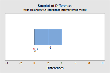
The boxplot of the heart rate data indicates that the median difference is very close to the mean (2.333). Both the median and mean are substantially greater than the reference value specified in H0 (0). In fact, H0 is located very close to the left edge of the box. Therefore, we know that approximately 75% of the sample differences are greater than 0. Thus, it seems unlikely that m D is 0.
The 95% confidence interval for the mean difference also indicates that m D is greater than 0. Since H0 lies outside of the confidence interval, we can say with 95% confidence that m is not equal to 0, but is instead between 0.477 and 4.190.