
Two-Sample Equivalence Test
Graphs - Boxplot
![]()
![]()
![]()
|
|
Two-Sample Equivalence TestGraphs - Boxplot |
|
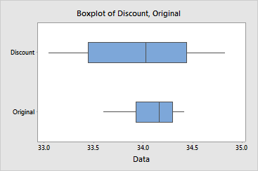
The boxplots illustrate the following properties of your data:
Example Output |
|
Interpretation |
|
For the cat food data, the variation in the discount formulation is greater than that of the original formulation. The means appear to be similar and there do not appear to be any outliers.