This graph plots
Period 1 responses on the x-axis against Period 2 responses on the y-axis.
Each sequence is represented by a different symbol. The diagonal line
shows where the x-values and the y-values are equal, for example where
x = 4 and y = 4.
Look for the following
patterns:
· Most
points for one sequence appear above the line and most points for the
other sequence appear below the line. This pattern indicates a treatment
effect. The response to the test treatment is different than the response
to the reference treatment.
· Most
points for one sequence appear in the lower left of the graph and most
points for the other sequence appear in the upper right of the graph.
This pattern indicates a sequence effect. The responses are generally
higher for one sequence than the other.
· Most
points for both sequences appear on the same side of the line. This pattern
indicates a period effect. The responses are generally higher during one
period than the other.
· The
points for both sequences are scattered randomly on the graph. This pattern
indicates that there is no effect of treatment, sequence, or period. The
responses are generally the same regardless of these factors.
Example Output |

|
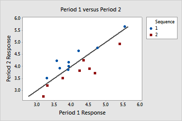
Interpretation |

|
The period plot for the antacid data clearly shows a treatment effect.
The following patterns indicate that, for both sequences, the brand-name
antacid was more effective than the generic antacid at raising stomach
pH:
· For
Sequence 1, almost all of the points are above the line. This indicates
that stomach pH was higher during Period 2 than during Period 1. Period
2 is when the brand-name antacid was given for Sequence 1.
· For
Sequence 2, all of the points are below the line. This indicates that
stomach pH was higher during Period 1 than during Period 2. Period 1 is
when the brand-name antacid was given for Sequence 2.
