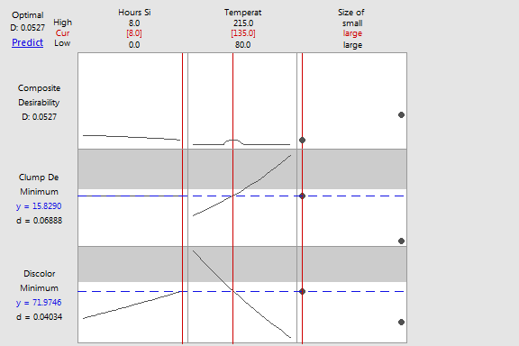
The optimization plot shows how the variables affect the predicted responses
and allows you to modify the variable settings interactively.
· Each
column of the graph corresponds to a variable.
· The
top row of the graph corresponds to the composite desirability, if shown.
Each remaining row corresponds to a response variable.
· Each
cell of the graph shows how the corresponding response variable or composite
desirability changes as a function of one of the variables, while all
other variables remain fixed.
· The
numbers displayed at the top of a column show the current variable settings
(in red) and the high and low variable settings in the data.
· The
Predict link in
the top left of the graph calculates the prediction for the current variable
settings.
· At
the left of each response row, Minitab shows the goal
for the response, the predicted response, y, at the current variable settings,
and the individual desirability score.
· The
composite desirability,
D, is displayed in the top row and the upper left corner of the graph.
· The
label above the composite desirability refers to the current setting and
changes if you move the variable settings interactively.
When the optimization plot is created, the label is Optimal.
If you change the settings, the label changes to New. If you find a new
optimal setting, the label changes to Optimal. If you save the current
setting, the label changes to a number to indicate the position in the
list of saved settings.
· The
vertical red lines on the graph represent the current settings.
· The
horizontal blue lines represent the current response values.
· The
gray regions indicate where the corresponding response has zero desirability.
Example Output |

|
Interpretation |

|
For the resin defect data, the global solution is unrealistic because
the Hours Since Cleanse cannot stay 0. Also, employees prefer to use the
large screw because the large screw moves the resin pellets faster. So
the employees interactively change the optimization plot to show settings
with a lower composite desirability than the desirability of the global
solution.
Current settings are temperature = 135,
hours since cleanse = 8,
and the size of the screw is large.
At these settings, the predicted number of clump defects is 15.8290
and the predicted number of discoloration defects is 71.9746.
The composite desirability of 0.0527
is lower than the desirability of the global solution because the predictions
are much closer to the upper limits for numbers of defects. Although these
predictions are below the limits, the employees click Predict
in the plot so that they can compare the confidence intervals to the limits
too.