
Gage R&R Study (Nested)
ANOVA Method
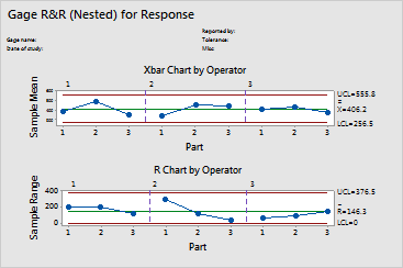
Graphs - R Chart
![]()
![]()
![]()
|
|
Gage R&R Study (Nested)ANOVA Method |
|
The R chart consists of the following:
If any of the points on the graph go above the upper control limit (UCL), then that operator is having problems consistently measuring parts. The UCL value takes into account the number of measurements by an operator on a part and the variability between parts. If the operators are measuring consistently, then these ranges should be small relative to the data and the points should stay in control.
|
Note |
If the subgroup size is greater than 9, an S Chart is displayed. |
Example Output |
|
Interpretation |
|
All of the parts data are "in control," indicating that the three operators are measuring consistently.