|
|
Equivalence Test with Paired DataGraphs - Subject Profile Plot |
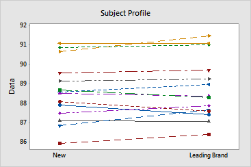
The subject profile plot shows the values for each pair of observations.
Example Output |

Interpretation |
The subject profile plot shows that the measurements vary between participants. However, both cleaning solutions seem to work equally well in all cases. The lines that connect each pair of observations are nearly horizontal. This pattern is consistent with the statistical results which suggest that both solutions are equally effective.