
Binary Fitted Line Plot
Graphs - Fitted line plot
![]()
![]()
![]()
|
|
Binary Fitted Line PlotGraphs - Fitted line plot |
|
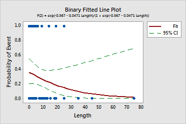
Minitab displays a plot of the data overlaid with a line illustrating the best fitting equation.
Example Output |
|
Interpretation |
|
The plot of the health care center data indicates that the probability that the hospital discharges a patient for other reasons decreases as the length of stay increases.
The confidence interval follows the line from 1 to 10 days, but the interval widens as length increases. The upper confidence limit starts to curve upwards. The upwards curve shows that the health care center cannot be statistically confident about the effect of long stays on how the center discharges a patient. In this data, the wide confidence interval is partly due to the small amount of data the center has on long stays.